library(tidyverse)如何使用ggplot2繪製長條圖
R
ggplot
barplot
告訴你如何繪製基本的長條圖並調整長條的顏色、寬度及排列順序。
這篇文章中,我會呈現使用ggplot2繪製長條圖的方法,其中包含如何調整長條的顏色、寬度及排列順序。我會使用R的tidyverse package來整理資料及繪製長條,所以要先載入它:
長條圖的基本繪圖方法
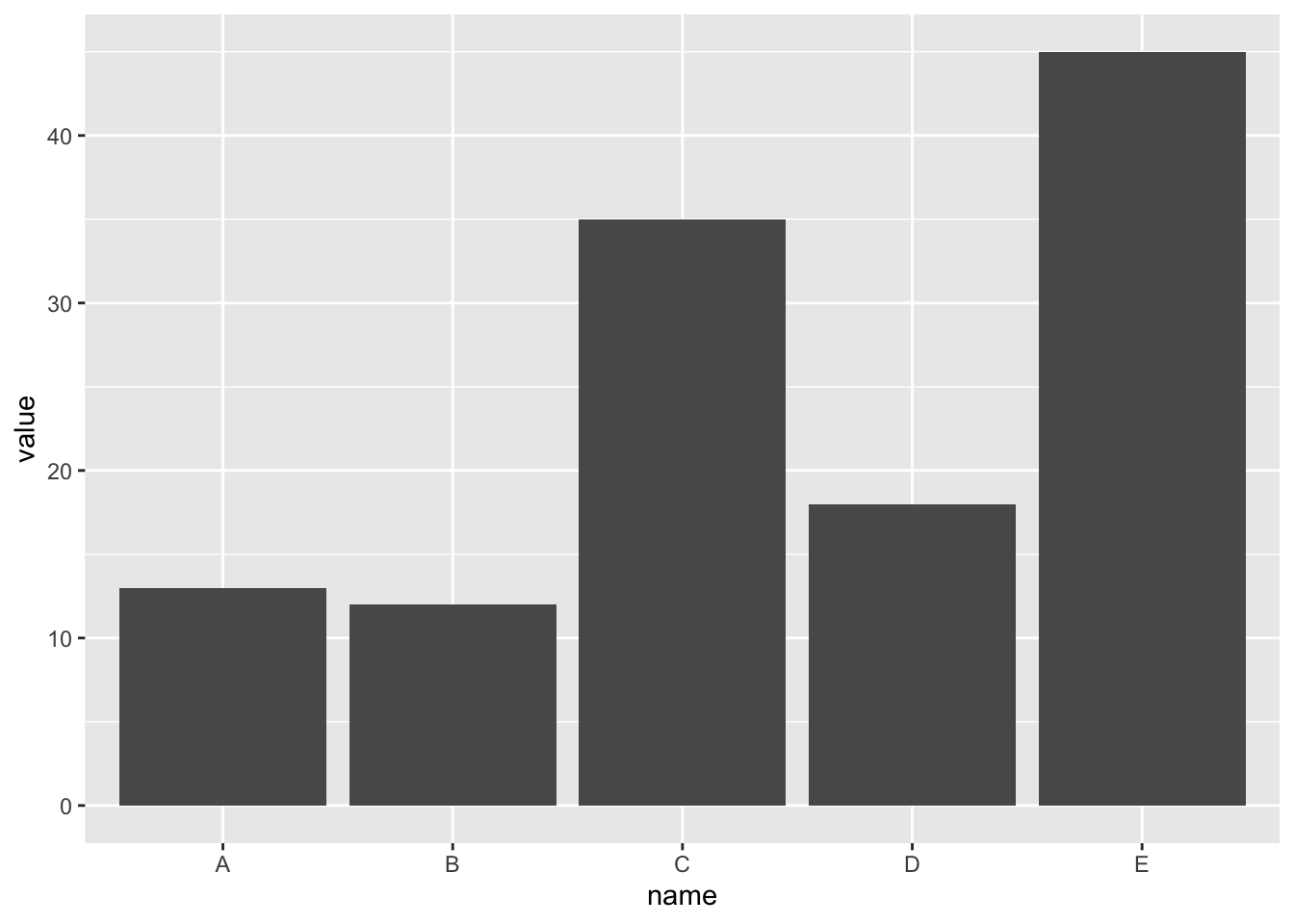
首先,我們先製作一個簡單的範例資料,其中包含name和value變數,name是我們要呈現的類別,value則是要繪製的長條的長度:
data <- data.frame(
    name = c("A", "B", "C", "D", "E"),
    value = c(13, 12, 35, 18, 45)
)
data
name value
1 A 13
2 B 12
3 C 35
4 D 18
5 E 45data.frame可以儲存不同型態資料的array,在這個例子中,data儲存了一個文字及一個數值的array,並且給了他們名字name和value 。
ggplot2繪製長條圖的步驟大致如下:
ggplot(data, aes(x = name, y = value)) +
    geom_bar(stat = "identity")
stat 設定成 "identity" 是因為這個資料集不需要作轉換,直接畫出值就可以。有一些資料集(tidy形式)則是在根據組別將資料集做分類及篩選後,再對資料作轉換,最常見的是將資料分類後去算有幾個資料項目屬於這個分類,所以default是stat = "count"。

控制長條的顏色
在這裡將使用mtcars資料集作為範例,這個資料集包含各種不同型號的汽車,我會展示不同汽缸數量的汽車各有幾輛。資料集大概長這樣:
                   mpg cyl disp  hp
Mazda RX4         21.0   6  160 110
Mazda RX4 Wag     21.0   6  160 110
Datsun 710        22.8   4  108  93
Hornet 4 Drive    21.4   6  258 110
Hornet Sportabout 18.7   8  360 175
Valiant 18.1 6 225 105cyl這個變數代表汽缸數量,先將cyl這個變數轉變為factor,在之後做圖的過程中會比較方便。
mtcars <- mtcars |>
    mutate(cyl = as.factor(cyl))
(1) 基本顏色設定
# color是外框,fill是填滿
ggplot(mtcars, aes(cyl)) +
    geom_bar(color = "blue", fill = rgb(0.1, 0.4, 0.5, 0.7))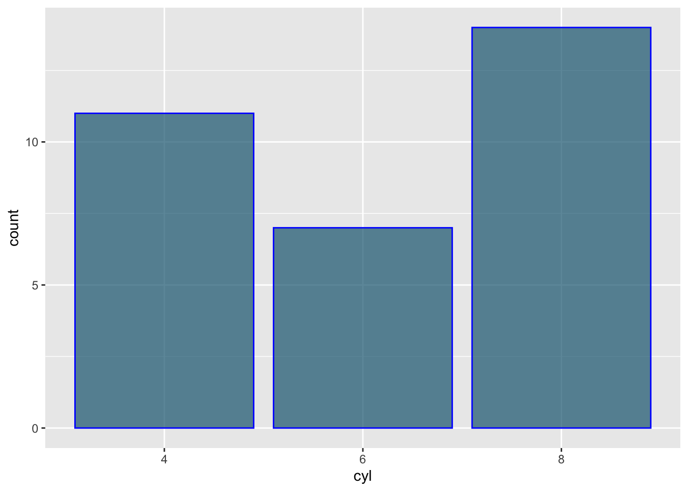
在這裡
ggplot先根據氣缸的數量將資料做分割,再計算數量,所以這裡的stat就是預設的"count"不需特別指定。color控制的是長條的外框,而非內部的顏色,fill才是控制填滿顏色的。rgb函數中的4個值分別代表了紅、綠、藍三種顏色,第4個則是透明度。可以分別放入[0,1]間的數字,數字越大,顏色越深,透明度越低。rgb顏色設定更常見的形式是像這樣 rgb(54, 194, 206),每個數值是落在[0,255]這個區間之間,rgb函數則是要透過設定maxColorValue來達成。例子如下:#設定想要的顏色 rgb_color <- rgb(54, 194, 206, maxColorValue = 255) #使用顏色畫圖 ggplot(mtcars, aes(cyl)) + geom_bar(fill = rgb_color)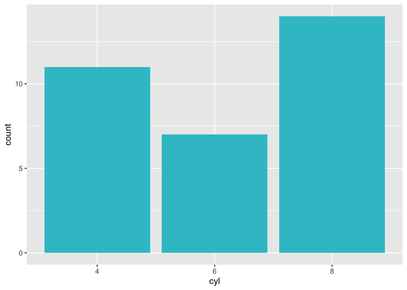
(2) 使用色相(Hue)
我們可以使用scalu_fill_hue來利用設定色相的方法調整顏色:
ggplot(mtcars, aes(x = cyl, fill = cyl)) +
    geom_bar() +
    scale_fill_hue()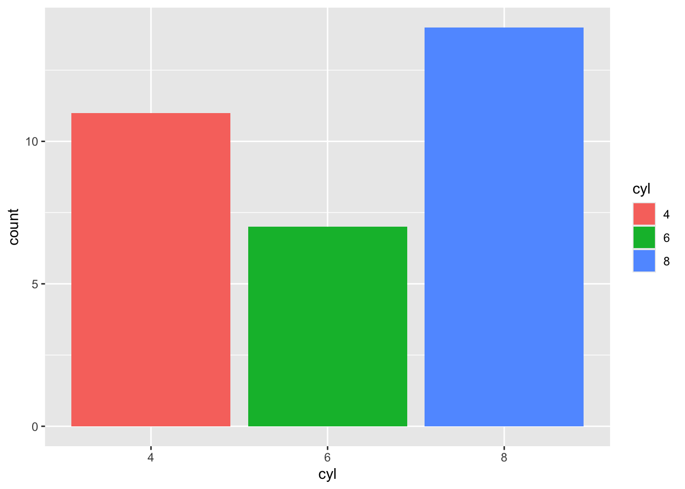
scale_fill_hue會根據h這個變量所指定的範圍中,等距的指定顏色。h的值會落在[0,360]間,以順時針的方向指定配色環的範圍:

ggplot(mtcars, aes(x = cyl, fill = cyl)) +
    geom_bar() +
    scale_fill_hue(h = c(0, 30))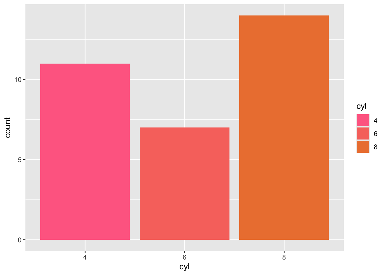
ggplot(mtcars, aes(x = cyl, fill = cyl)) +
    geom_bar() +
    scale_fill_hue(h = c(180, 210))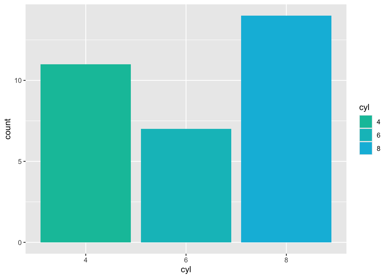
ggplot(mtcars, aes(x = cyl, fill = cyl)) +
    geom_bar() +
    scale_fill_hue(h = c(0, 180))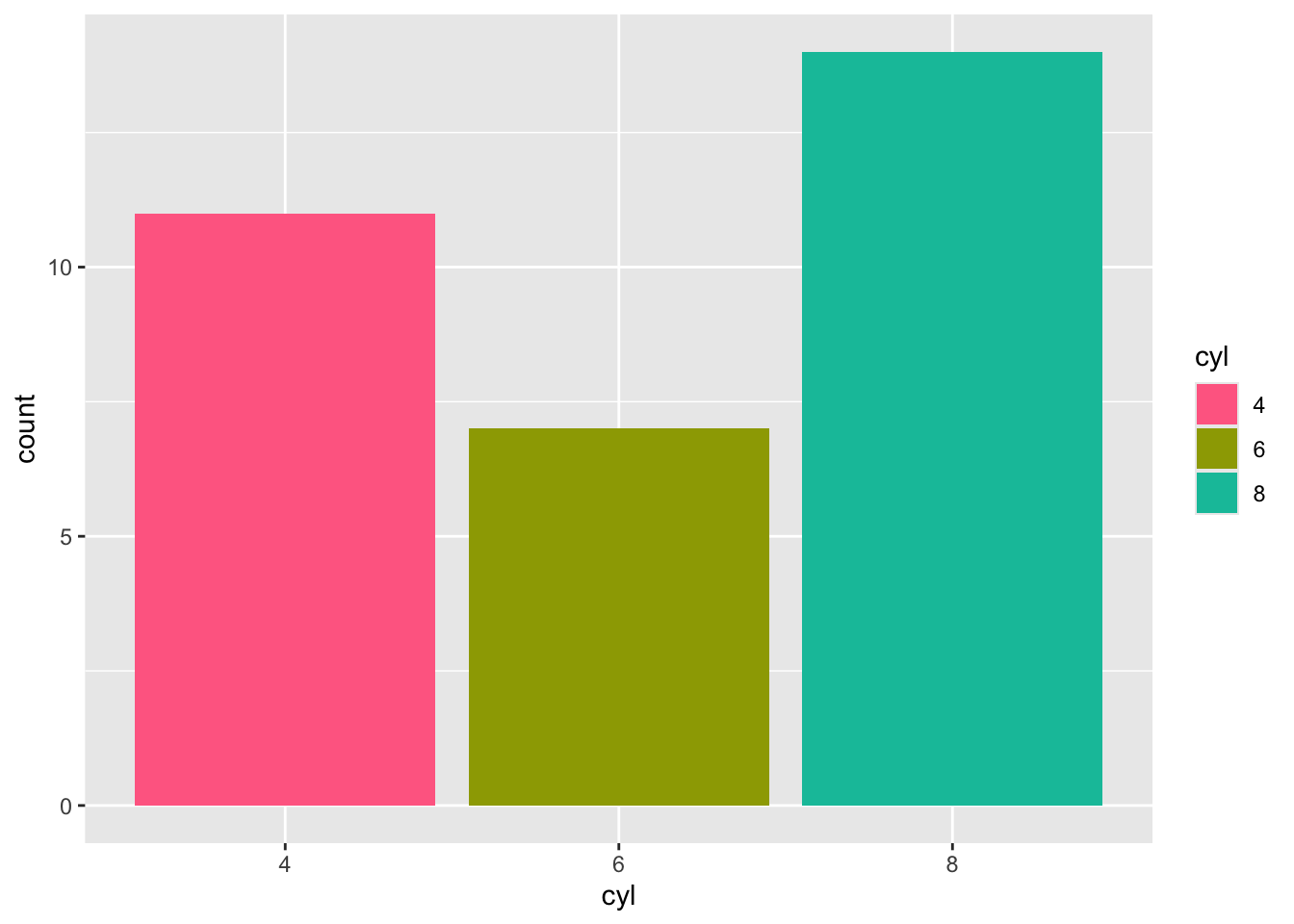
scale_fill_hue中得c和l則是分別指定深淺及亮度,可以放入[0,100]中的值:
ggplot(mtcars, aes(x = cyl, fill = cyl)) +
    geom_bar() +
    scale_fill_hue(h = c(0, 180), c = 90) #較大的c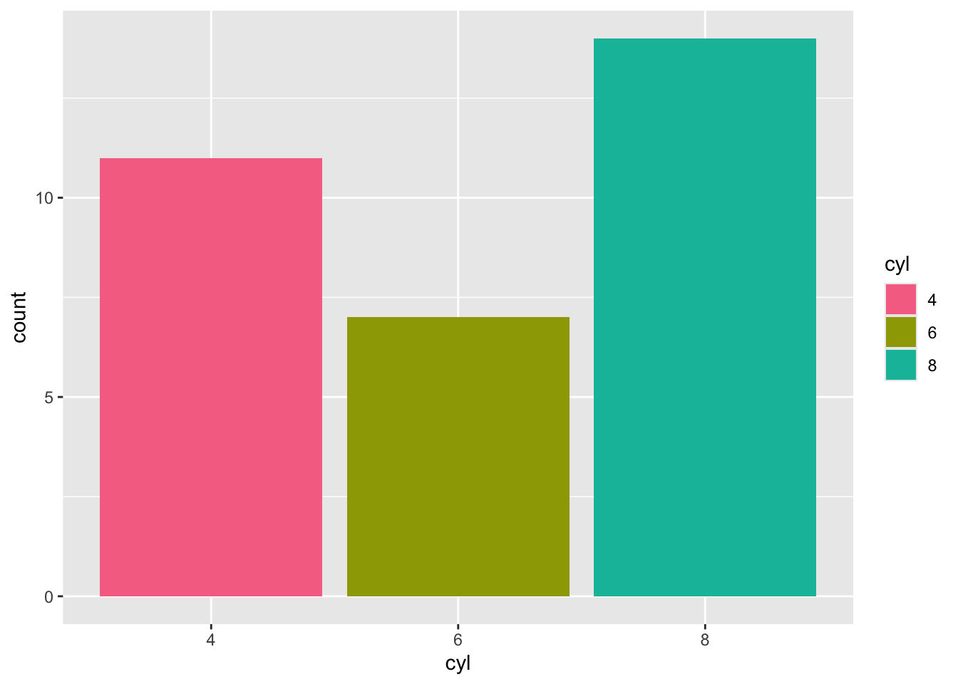
ggplot(mtcars, aes(x = cyl, fill = cyl)) +
    geom_bar() +
    scale_fill_hue(h = c(0, 180), c = 40) #較小的c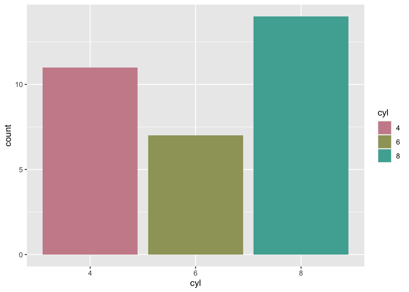
ggplot(mtcars, aes(x = cyl, fill = cyl)) +
    geom_bar() +
    scale_fill_hue(h = c(0, 180), l = 90) #較大的l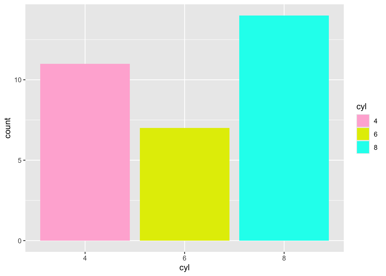
ggplot(mtcars, aes(x = cyl, fill = cyl)) +
    geom_bar() +
    scale_fill_hue(h = c(0, 180), l = 30) #較小的l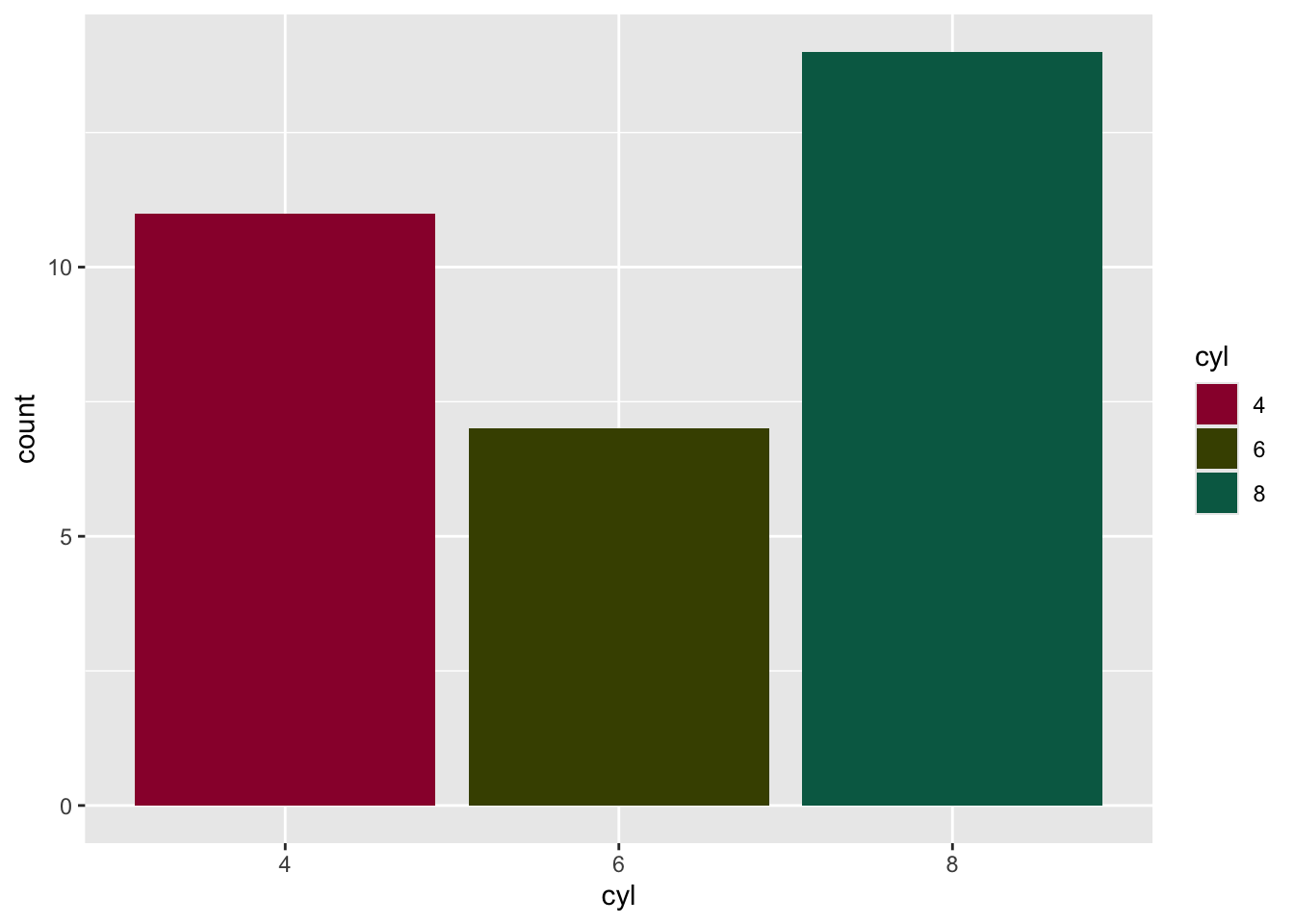
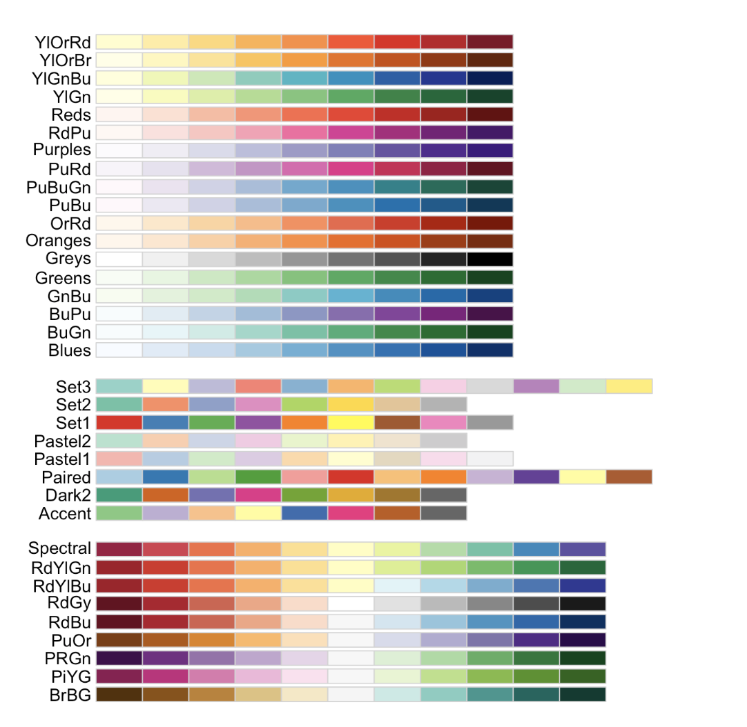
(3) 使用RColorBrewer
RColorBrewer提供了幾組可用的顏色:
用法是在ggplot2的scale_fill_brewer函數中輸入想要的顏色代碼:
ggplot(mtcars, aes(x = cyl, fill = cyl)) +
    geom_bar() +
    scale_fill_brewer(palette = "Dark2")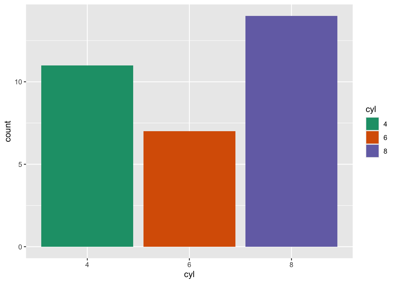
(4) 手動設定個別長條的顏色
scale_fill_manual讓你可以手動指定顏色,要注意的是指定的顏色數量至少要多於種類的數量。
ggplot(mtcars, aes(x = cyl, fill = cyl)) +
    geom_bar() +
    scale_fill_manual(values = c("red", "blue", "green"))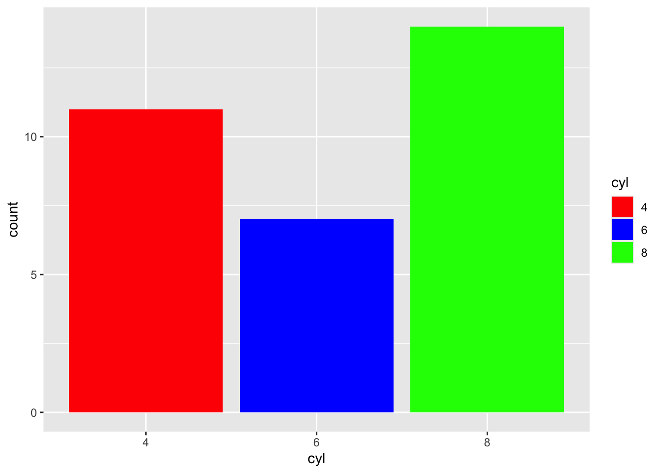
也可以指定16進位色碼:
ggplot(mtcars, aes(x = cyl, fill = cyl)) +
    geom_bar() +
    scale_fill_manual(values = c("#F4CE14", "#379777", "#45474B"))
或使用rgb函數:
colors <- c(
    rgb(244, 206, 20, maxColorValue = 255),
    rgb(55, 151, 119, maxColorValue = 255),
    rgb(69, 71, 75, maxColorValue = 255)
)

ggplot(mtcars, aes(x = cyl, fill = cyl)) +
    geom_bar() +
    scale_fill_manual(values = colors)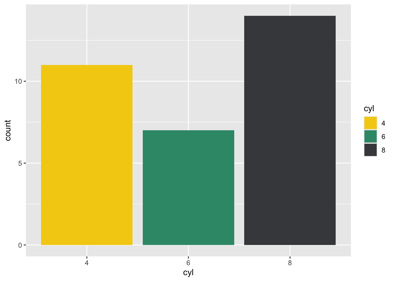
繪製橫向長條圖
如果想要使用橫向長條圖的話,可以將aes()中x與y調換:
ggplot(data, aes(x = value, y = name)) + #調換x和y
    geom_bar(stat = "identity")
或是使用coor_flip函數:
ggplot(data, aes(y = value, x = name)) +
    geom_bar(stat = "identity") +
coord_flip() 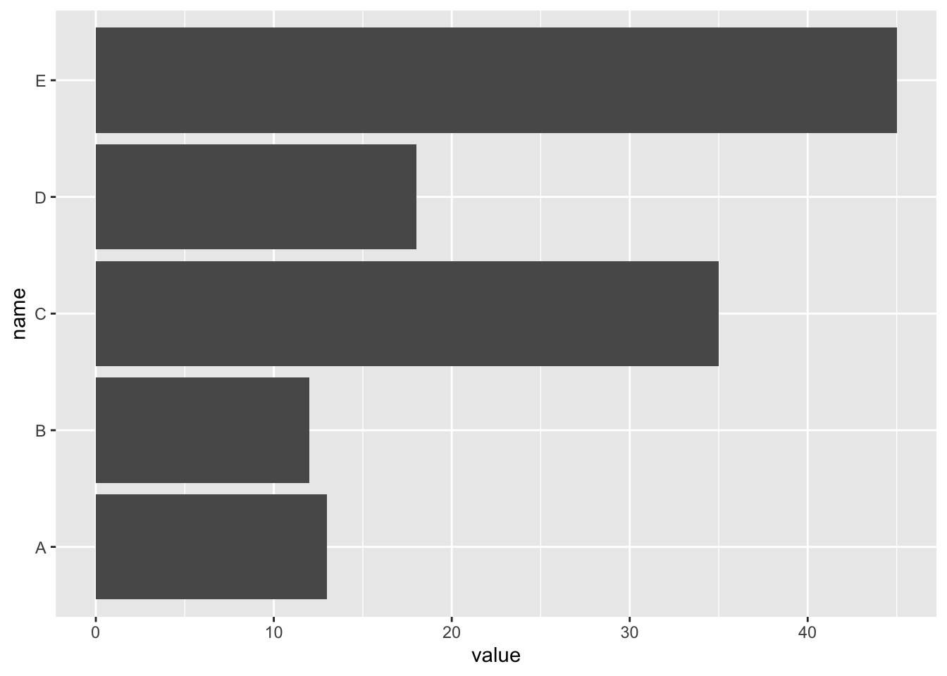
調整長條寬度
我們可以透過geom_bar中的width這個argument來調整長條的寬度:
ggplot(mtcars, aes(x = cyl)) +
    geom_bar(width = 0.1)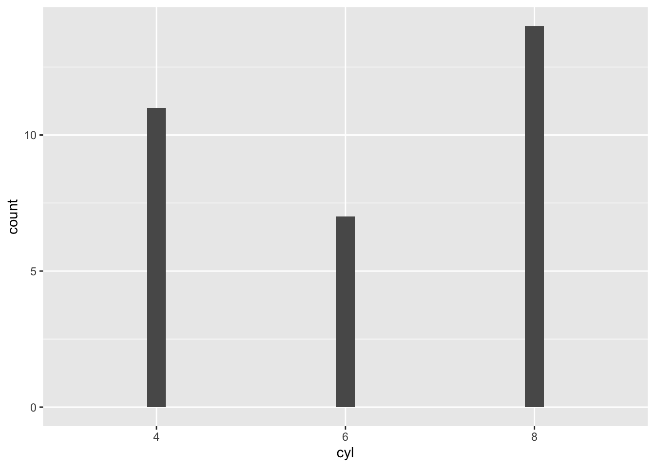
width中可放入[0,1]之間的數值,越大越寬:
ggplot(mtcars, aes(x = cyl)) +
    geom_bar(width = 0.99) #很寬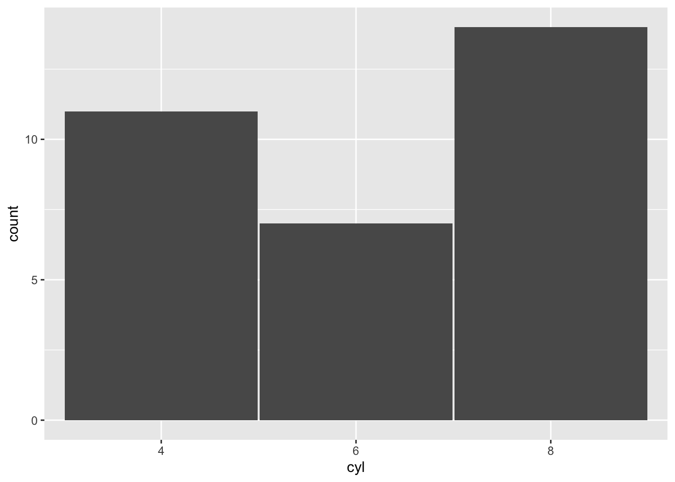
ggplot(mtcars, aes(x = cyl)) +
    geom_bar(width = 0.01) #很窄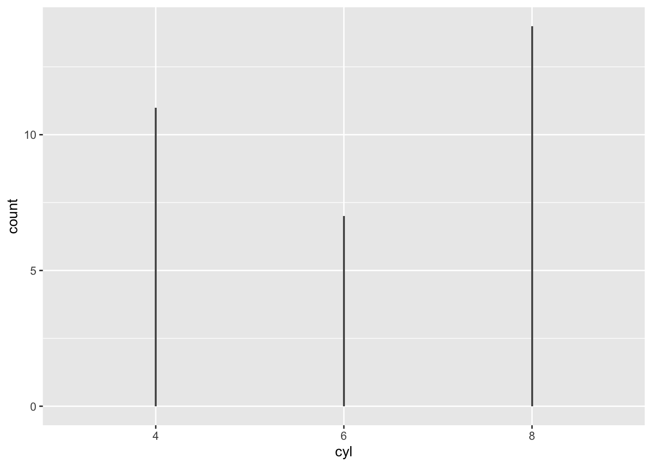
不同類別使用不同的寬度
width這個aesthetic可以讓你調整個別的長條寬度,我現在data中加入一個width變數,讓每一個類別根據其數值調整寬度,數值是預設寬度的倍數:
data |> mutate(
    width = c(.5, .9, .4, .3, 1) # E是原來的寬度,A則是一半,
) |>
    ggplot(aes(x = name, y = value, width = width)) +
    geom_bar(stat = "identity")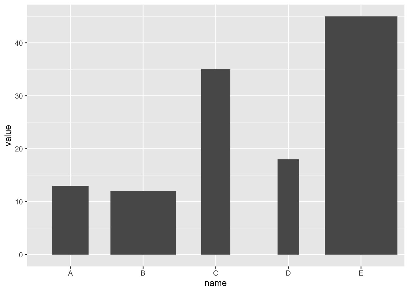
調整長條排列的順序
在ggplot2中,如果要根據長條的高度(或長度)做排序,比較方便的做法先算出每一個類型的數量,再根據數量做排序,最後以stat = "identity" 的設定來畫出圖形。以下的例子會一步一步的展示怎麼做:
(1) 使用tidyverse中的group_by函數將資料依汽缸數做分割,再使用summarise算出每一種汽缸數的車輛數:
mtcars |>
    group_by(cyl) |> # 分組
    summarise(n = n()) # 計算數量
# A tibble: 3 × 2
cyl n
<fct> <int>
1 4 11
2 6 7
3 8 14(2) 使用fct_order函數將cyl的level按照n排序:
mtcars |>
    group_by(cyl) |>
    summarise(n = n()) |>
    mutate(cyl = fct_reorder(cyl, n)) #調整levels,根據n的大小
# A tibble: 3 × 2
cyl n
<fct> <int>
1 4 11
2 6 7
3 8 14我們可以看到在重新排序前,cyl的levels是”4”->“6”->“8”:
mtcars |>
    group_by(cyl) |>
    summarise(n = n()) |>
    str()
tibble [3 × 2] (S3: tbl_df/tbl/data.frame)
$ cyl: Factor w/ 3 levels "4","6","8": 1 2 3
$ n : int [1:3] 11 7 14重新排序後,cyl的levels是”6”->“4”->“8”:
mtcars |>
    group_by(cyl) |>
    summarise(n = n()) |>
    mutate(cyl = fct_reorder(cyl, n)) |>
    str()
tibble [3 × 2] (S3: tbl_df/tbl/data.frame)
$ cyl: Factor w/ 3 levels "6","4","8": 2 1 3
$ n : int [1:3] 11 7 14(3) 最後整合起來,畫出圖形:
mtcars |>
    group_by(cyl) |>
    summarise(n = n()) |>
    mutate(cyl = fct_reorder(cyl, n)) |>
    ggplot(aes(x = cyl, y = n)) +
        geom_bar(stat = "identity") #不需計算,所以是"identity"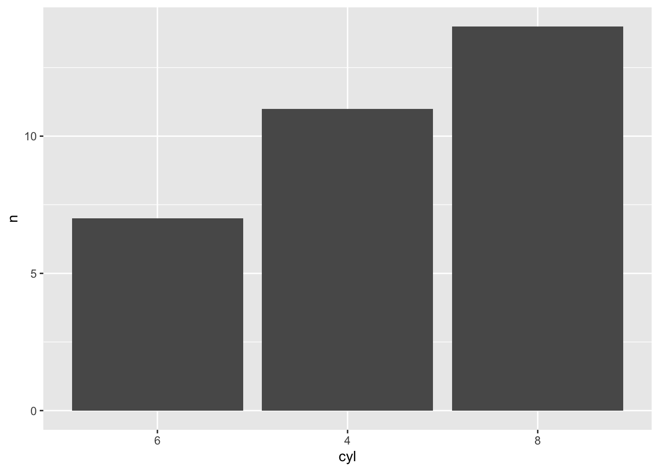
若是想要從大排到小,則是要在fct_reorder中要排序的依據加上desc():
mtcars |>
    group_by(cyl) |>
    summarise(n = n()) |>
    mutate(cyl = fct_reorder(cyl, desc(n))) |> #根據n的大小排序,由大到小
    ggplot(aes(x = cyl, y = n)) +
        geom_bar(stat = "identity")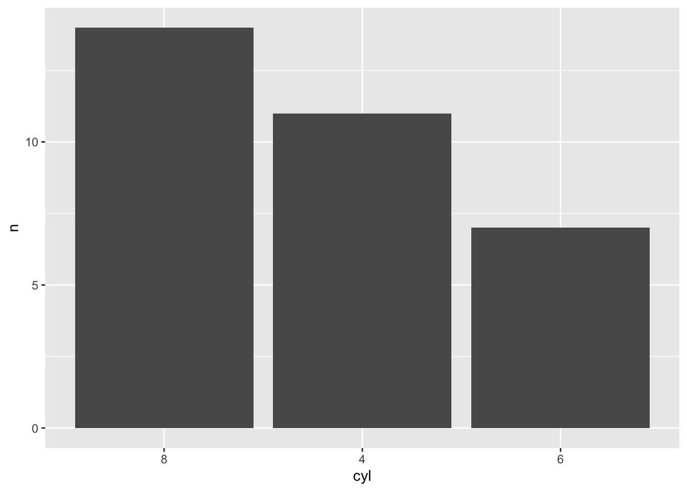
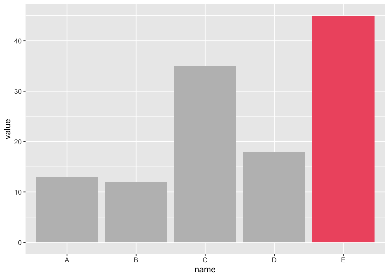
利用顏色強調特定類別
當呈現的類別變數中,有特定的類別是我們想要特別強調的,舉例來說,我們特別關心的類別或數值特別高的類別,我們可以透過標記特別的顏色來強調其重要性,以此引導讀者關注的重點,傳達我們想表達的資訊。
假設我們想要標記下方圖型中,數值最高的E這個類別:
我們首先要做的是先製作出一個標記用的變數:
data |>
    mutate(
        #當name的值是E時,mark的值會是marked,其他則是unmarked
        mark = if_else(name == "E", "marked", "unmarked")
    )
name value mark
1 A 13 unmarked
2 B 12 unmarked
3 C 35 unmarked
4 D 18 unmarked
5 E 45 marked接著告訴ggplot函數我們要以此變數上不同的顏色:
data |>
    mutate(
        mark = if_else(name == "E", "marked", "unmarked")
    ) |>
    ggplot(aes(x = name, y = value, fill = mark)) +
    geom_bar(stat = "identity")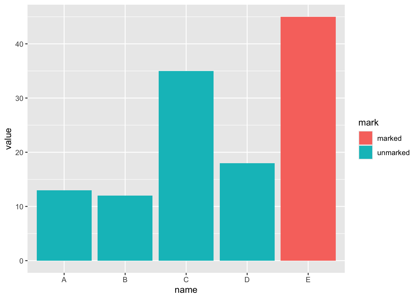
可以手動調整顏色,更加的強調類別,並且關掉圖示:
data |>
    mutate(
        mark = if_else(name == "E", "marked", "unmarked")
    ) |>
    ggplot(aes(x = name, y = value, fill = mark)) +
    geom_bar(stat = "identity") +
    scale_fill_manual(values = c("#EF5A6F", "grey")) + #調整顏色
    theme(
        legend.position = "none" #關掉圖示
    )